In the corporate and business world, Microsoft Excel is very useful. For speedy calculation, data analysis, and avoiding data redundancy, learning Excel skills is a boon. Creating pivot tables, other tables, charts, and management data is an easy process. Even after these different and easy sets of functions, some typical processes like creating histograms raise questions for us. Many Microsoft Excel trainers and gurus find it hard to let their students understand easily the process of creating histograms. So, let’s face it together, as today, in this post, we have covered everything about “How to Make a Histogram in Excel.”
Microsoft Excel offers us diverse methods of creating histograms. In this post, we will cover what is histogram, what are the two different methods of creating a histogram along with their advantages and disadvantages. So, let’s begin with the handy concepts.
Table of Contents
What is Histogram?
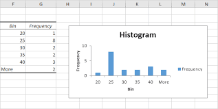
Because of the excessive popularity of “Histogram”, we are keen to understand what is the histogram. So, let’s infer the meaning properly. A histogram is a chart that arranges the frequency distribution of different sets of values. Some people related histogram to a column chart. But you must understand that these charts may look similar to you but they are quite different. Are you keen to learn how to make a histogram in Excel? For your sake, we will give you a perfect description for making a histogram in Excel without any errors.
How to Create a Histogram in Excel- Different Processes
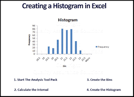
Creating a histogram is not tough, but you should be clear about the technicalities. The sole motive behind creating a histogram is to visualize the complex data into an easy-to-understand mechanism. For easy understanding, the histogram groups the data into bins. These bins will represent the data points in the form of bars and columns. Let’s understand the creation of a histogram with the process of the three important methods. The first one is “ “Data Analysis Method.” The following steps will help you to create a histogram using the Data Analysis Method.
1) Input the Data
You must enter the data for which you want to create a histogram into your Excel spreadsheet. For example, suppose you have students’ exam scores and you want to create a histogram for it, you must input the entire data set into a single column. You can arrange these numbers in Column A starting from cell A1 and so on. Now, move on to the next step.
2) Enable the Data Analysis Tool
In this step, you must enable the data analysis tool. For this purpose, go to Excel, then File, Options, and Add-Ins. Further, in Add-ins, you will see a dialogue box, select Analysis tool Pak, and then you should click on Ok.
3) Ensure Easy Access to the Data Analysis Tool Pak
Now, go to the data tab in Excel, and visit the analysis group, you should see the Data Analysis option or tab. Now, click on Data analysis, and you will see a dialogue box will appear. Scroll down and then select Histogram, and then click on “OK.”
4) Specify the Input Range
Now, open the histogram dialogue box, and you will specify the Input range. Click on the field immediately next to the Input range. Select the range of data you entered in Column A in different cells say A1 to A10. This data pertains to the different marks of students.
5) Click on the Next Field to Bin Range

You must click on the field next to the Bin Range. You can select a specific cell where you want to display these Bin ranges, say B1. Otherwise, you also have the option of leaving the cell blank. In this case, Microsoft Excel will automatically create the Bin ranges for you. Choose Appropriate Output Options for You.
Choose the exact location where you want the histogram to appear. You have both the options to exercise. Either you can create a histogram in the existing sheet, or else, you can also opt for a new sheet. After choosing the location, you must click “OK in the histogram dialogue box.
6) View and Customise
Now, Excel will create the histogram chart based on your data. Now, you will see a frequency distribution of scores of students in the form of a chart. Using Microsoft Excel also allows us to customize the histogram charts. You can add labels, change colors, and adjust the properties of other charts.
7) Save the Histogram
The last step in creating a histogram is saving it in the Excel file, or else transporting it to use in different formats like reports and presentations. You have completed all the steps of creating a histogram with the Data Analysis method.
The Insert Chart Method
The Key steps used in the Insert Chart Method for Creating a Histogram are as follows
1) Input the Data
Open your Microsoft Excel Spreadsheet and enter the data you want to create a histogram for in a single column. For example, if you have similar exam scores that you used to prepare the histogram in the data analysis method, you can input the data in Column A starting from the A1 range.
2) Select the Data
Once you have input the data as guided, you should go to the column header and click on a particular set to select the entire column of Data. Now, after the selection of data, you should go to the Insert tab.
3) Choose the Chart Type
Now, go to the chart type and select Bar chart or else, column chart. Now, a dropdown menu will appear. From that dropdown menu choose Histogram. Now, Microsoft Excel will automatically create a histogram chart based on your data inputs.
4) Customize and View the Histogram
You can customize the histogram chart by adding the titles, and labels, and adjusting the appearance of the chart. The histogram chart will appear in your Excel sheet. You can also exercise the option of transporting it to some other place to use it in reports and presentations.
5) Save or Copy the Histogram
Now, this is the last step in which you can easily save the Histogram or else, copy the entire data into a place where you need the histogram. Congratulations, you have successfully learned how to create a Histogram in Excel using the Insert Chart option.
How to Create a Histogram in Excel Using Frequency Function Method?
Last but not least, you can create a histogram in Microsoft Excel using “the frequency function method as well. Here are the key steps to follow regarding this.
1) Prepare the Data and Input It
Let’s use the different scores of students that we have already used in the insert chart and Data analysis method. Select a particular column and insert your data in A1 to A10. Now, let’s move on to the next step.
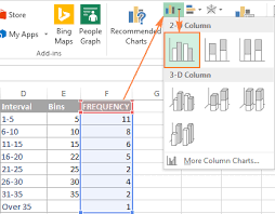
2) Define the Bin Ranges
In the frequency function method, you must define the Bin ranges to proceed toward the creation of a histogram. These Bin ranges are frequent intervals in which you will group your data for your convenience and smooth creation of a histogram. For example, for the test scores, the bin value can range from 0-59, 60-69, 70-79, 80-89, and 90-100.
Now, you have entered these Bin ranges into a separate cell suppose D1 to D5 to enter these Bin ranges. Once you have entered these values, you must press Ctrl + Shift + Enter. Once you have done this process, you will view the curly braces in the formula bar.
3) Check the Frequency Distribution
Now, the different values in Column B will represent the frequency distribution. For example, Bin One value is 0-59, and Bin 2 value is 60-69, and so on.
4) Create a Histogram Chart
Use the frequency distribution mentioned in Column B to create a Histogram chart. Select the data values in both columns D and B and after that go to the insert tab. Go to the chart group and then select the Bar Chart, or else, Column Chart. With this step, Microsoft Excel will create a histogram chart based on the frequency function. You can also customize the histogram chart. It will make it easy for you to analyze and interpret the data.
Conclusion
This is how you can create a histogram in Excel. We have covered all three methods related to histogram creation. For example, you can choose the data analysis method, insert chart option, and frequency distribution method. Try these methods for the best results and if you face any problems, do let us know through comments. We will be happy to help you out in the process.


